Transforming ideas into visuals through thumbnails, logos, marketing materials, and Photoshop mockups.
Recent Work
Metaverse Spread
For my graphic design minor, I had to create an InDesign spread on any topic of my choice. Two of my favorite movies are Tron: Legacy and Ready Player One. Both include the most vivid concepts of the Metaverse and I wanted this project to be fun to create.
-
Being given a blank canvas and told to create something can be daunting, especially when user-friendly platforms like Canva or CapCut make everyone look like a professional designer with captivating templates. Before this project, I was so used to relying on templates that I felt overwhelmed about where to even begin. I had a vision in my head, and now I just needed to figure out how to execute it.
-
I was fortunate to have a great professor guide me through creating this project. She taught me how to use InDesign, but it was up to me to develop my creativity. I envisioned something colorful, consistent, and centered around technology. On the inside, I paired each paragraph and quote with matching colors and used images from the same artist to maintain a unified aesthetic.
-
This project taught me the importance of fonts, empty space, and color contrast. I also learned why hierarchy is crucial for effective storytelling. As a reader, where should your eyes go first? What follows next? Could you skim this and still gain value? I focused on making quotes stand out and align with their corresponding paragraphs, ensuring that even a quick glance at the quotes would entice readers to explore further. Guiding the reader’s journey through the design was my priority. I ensured it was easy to navigate and avoid getting lost while reading.
Infographics
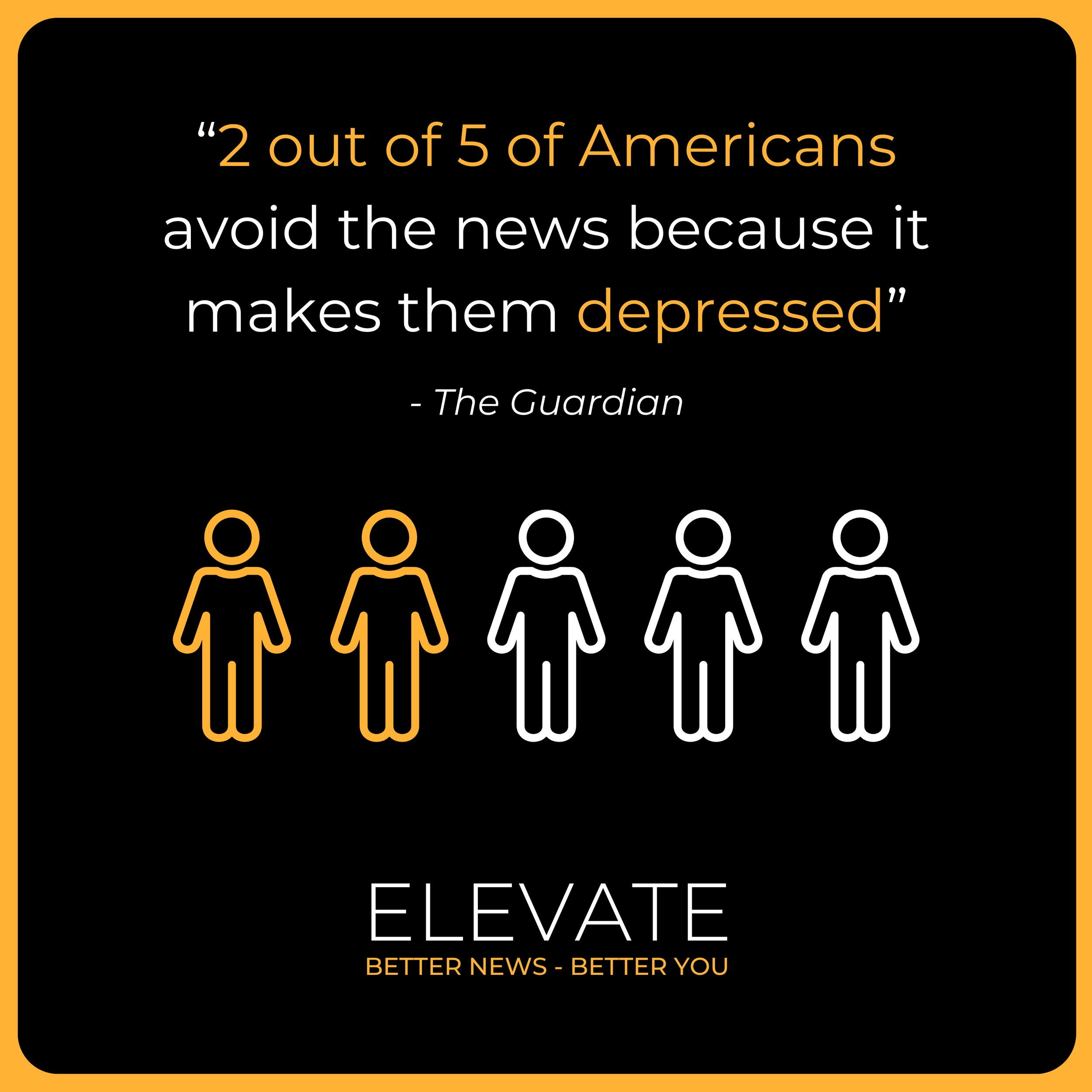
Created for ElevateNewsApp.com and their Instagram, these infographics are designed to deliver statistics quickly. Think of them as an adult ‘picture book’ to simplify data and make it more digestible.
Logo Design
Logos are a universal language. Creating a logo is a long, detailed process but is imperative for great branding. A good logo will be scalable and look good in all sizes. A great logo will have variations. A perfect logo will be dynamic and look nice on any background. My designs below incorporate all of the above.
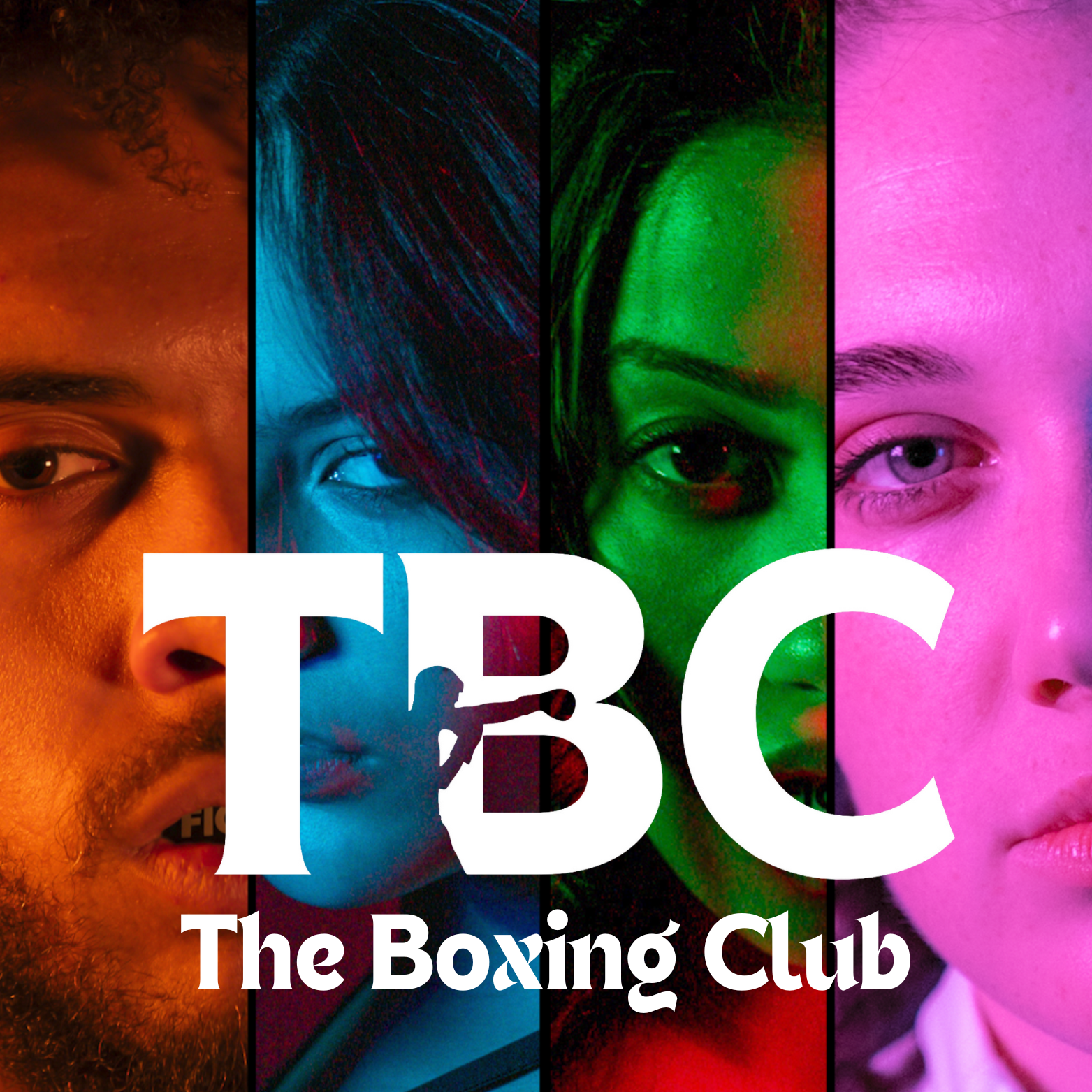
Above is the logo I created for the college club I created at The Fashion Institute of Technology. People started referring to The Boxing Club as “TBC” and I wanted a way to simplify our branding.
Elevate News is an app I self-developed that only showcases positive content. I wanted something that conveyed the words “Elevate” and happiness, hence the yellow and straightforward font.
Elevate’s Branding
Small details are important. People aren’t loyal to products; they’re loyal to brands. Building Elevate, I knew I needed to create a modern, eye-catching brand foundation that would set us apart.
LinkedIn Carousel
Gone are the days of long text-based LinkedIn posts. Today, the best way to capture attention is a series of infographics with pleasing designs and color. View the full post here.
*Created from scratch, not a template
Elevate Ads
The goal was to focus attention on the product while also displaying important, simple, and quick information.
Thumbnails
Never judge a book by its cover, but always judge a video by its thumbnail. A well-designed thumbnail can showcase the video's quality, relevance, and creativity. I designed these thumbnails for The Unconventional Podcast I produced. Each thumbnail follows the same design layout for consistency. Check out more from The Podcast here.
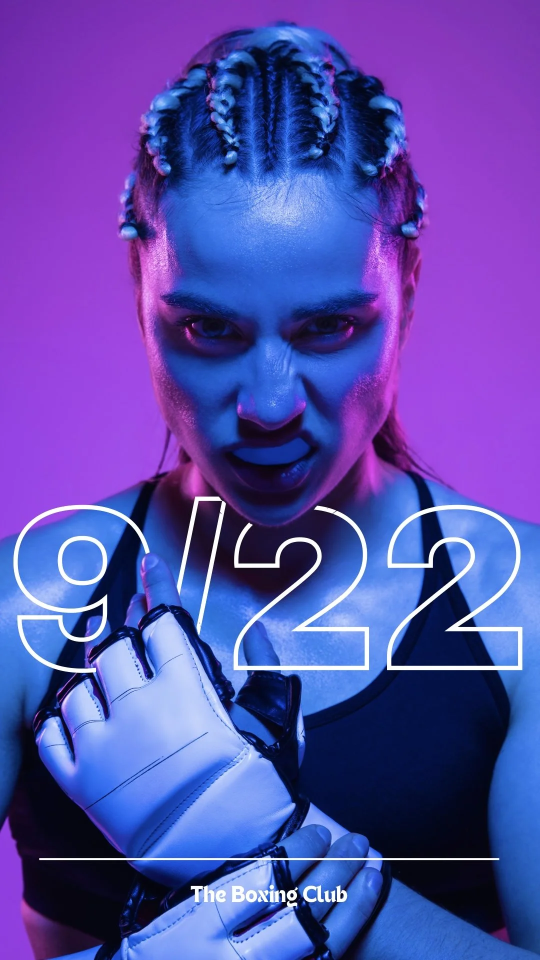
Instagram story posters
Swipe for more
More From Portfolio
Below is a homemade Valentine's Day card inspired by my favorite love songs. Why rely on Hallmark when I’m good at graphic design?
Swipe for more
VIRAL OR VITAL
Within the past few years, the One Chip Challenge has become very popular. Unfortunately, this craze resulted in the death of 14 year old boy. This PSA aims to highlight the dangers of such challenges and the allure of going viral. #ViralOrVital
Before
After
Before
After
Love song lyrics
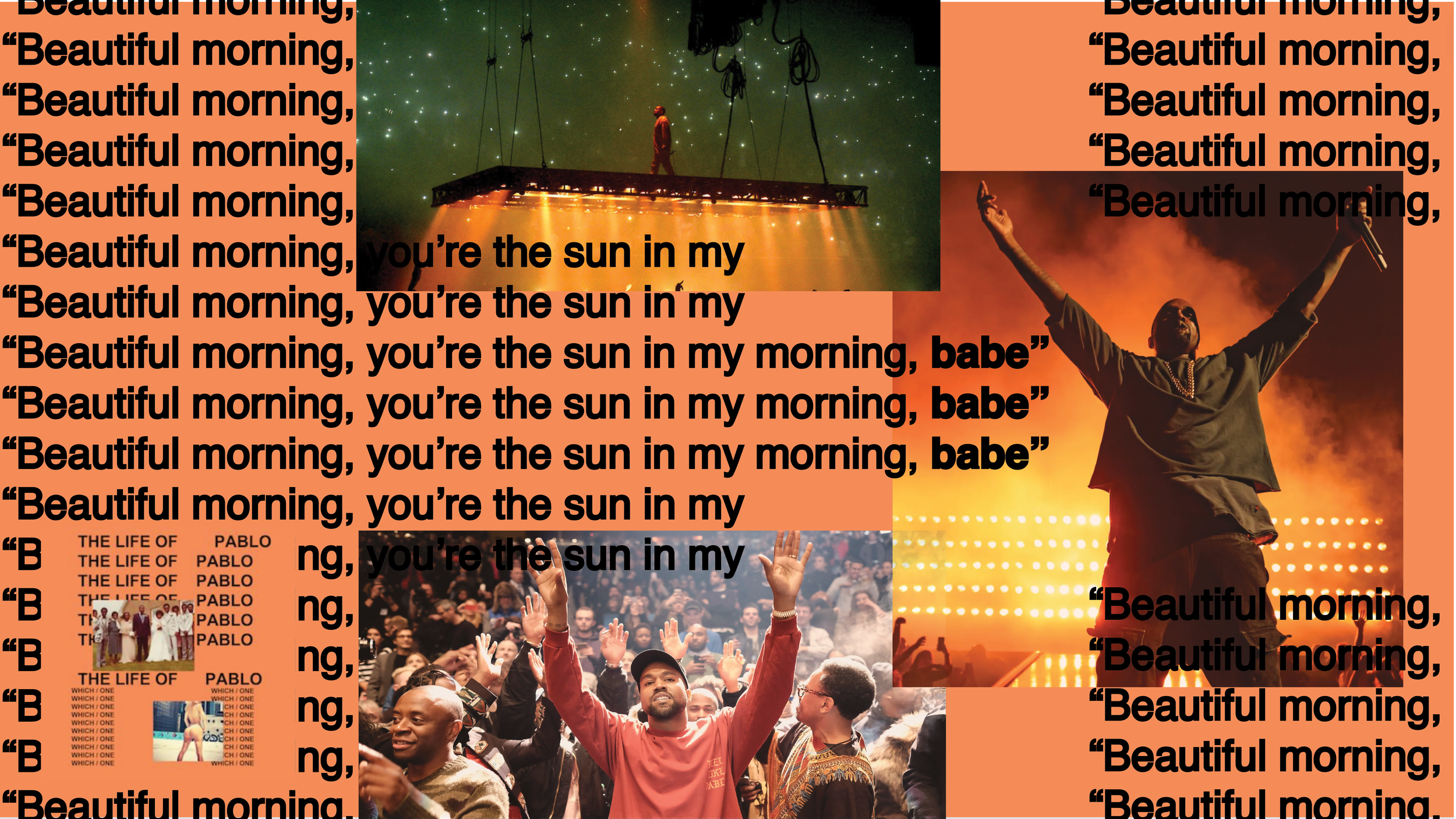
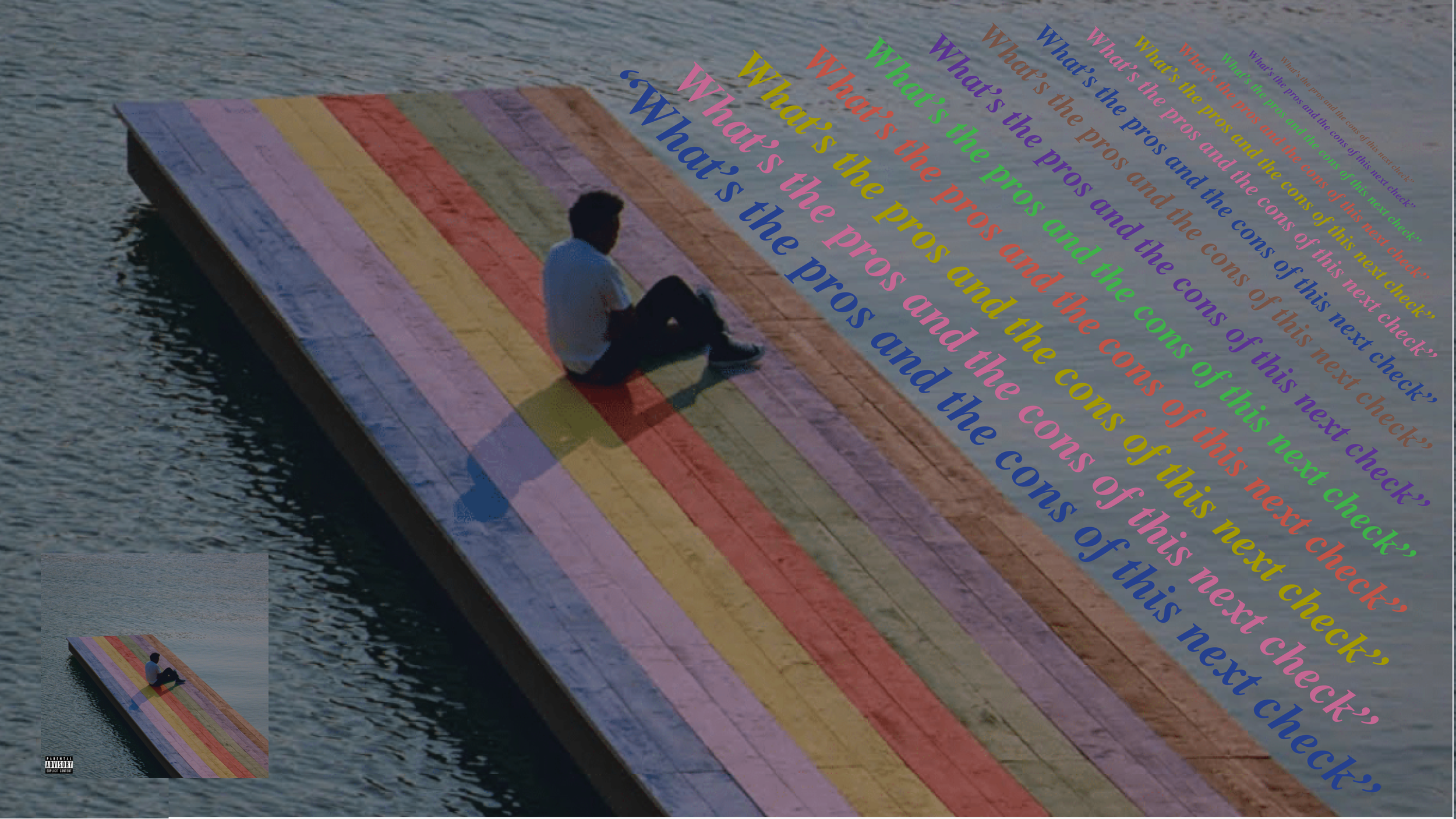
I created designs inspired by popular love and heartbreak songs. Focusing on typography, each design highlights a lyric with graphics that reflect the album's original theme, seen at the bottom left of each slide.
Swipe for more
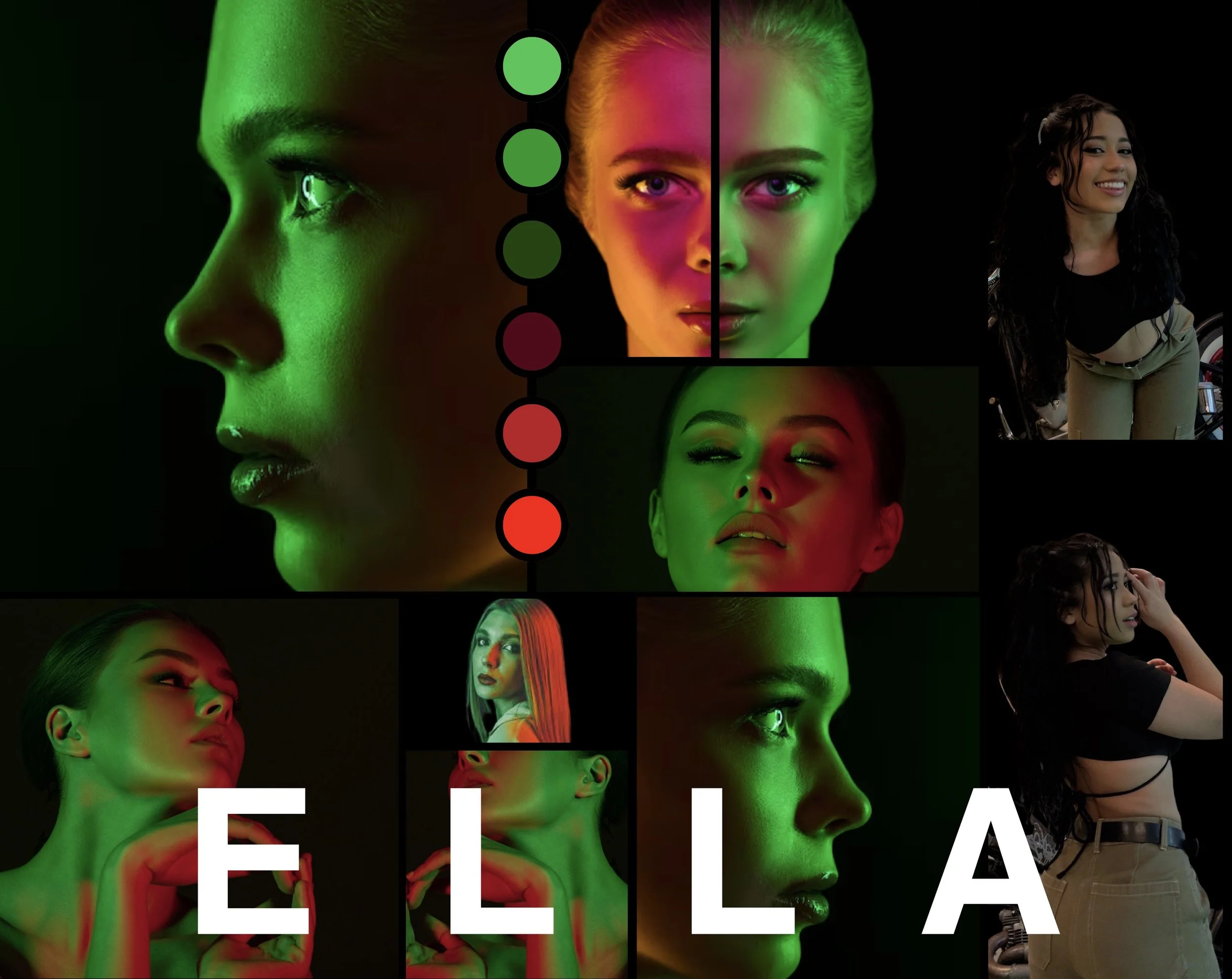
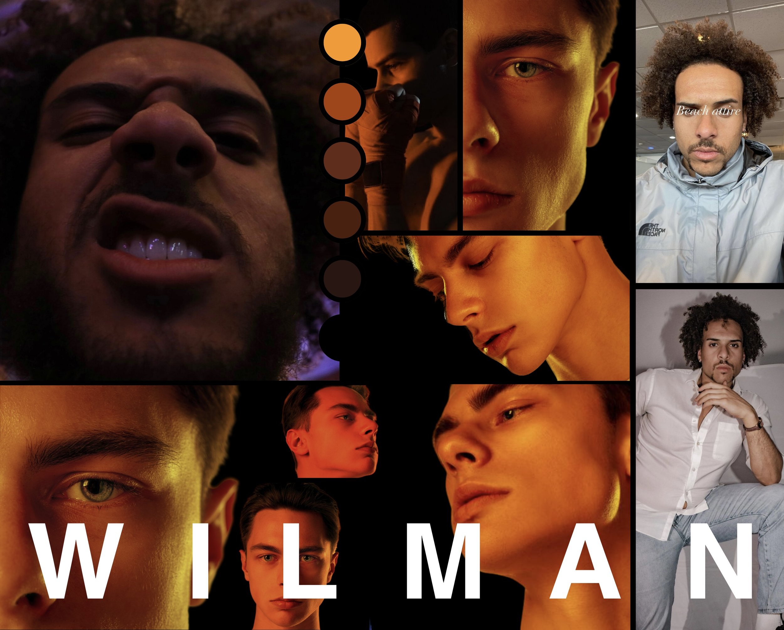
Moodboards created for Times Square


